Pet · Mobile & Web
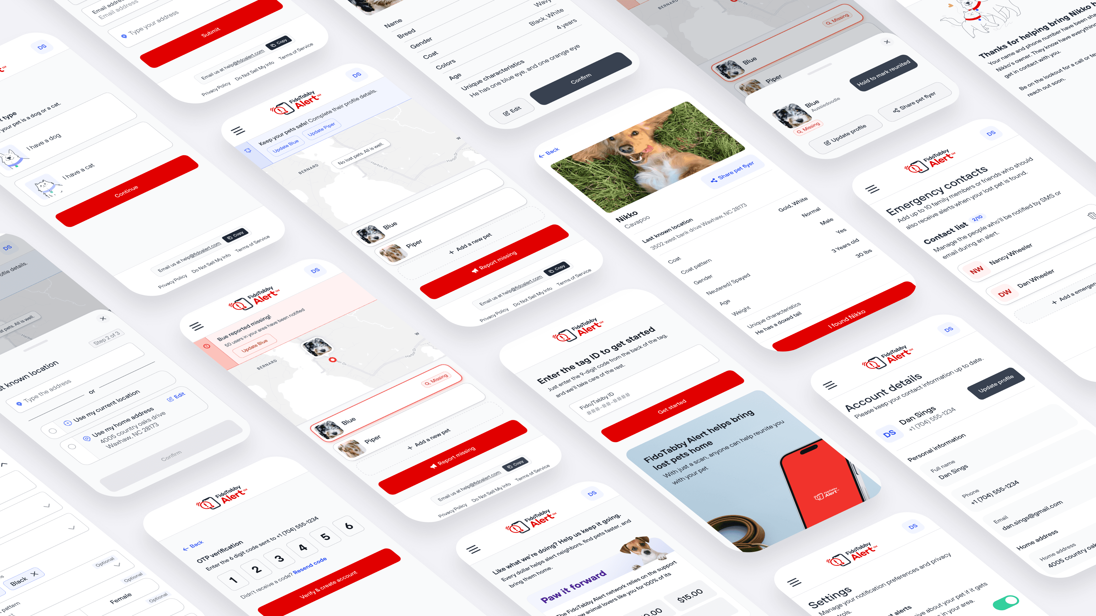
FidoAlert is a free, nationwide lost pet alert system trusted by over 1.6 million users. My goal was to redesign the platform to simplify the lost pet alert flow and introduce a new "tag-first" retail experience — bridging digital and physical product touchpoints.
The Problem
Users struggled to act quickly during the most stressful moments — the experience created hesitation and drop-off at exactly the wrong time.
Results
These aren't projected numbers — they're actual metrics from after the redesign shipped.
Empathy Mapping
Empathy mapping uncovered deeper emotional drivers and pinpointed moments of friction across the experience — especially during high-stress moments like reporting a lost pet. These insights directly informed design decisions that reduced anxiety, clarified next steps, and reinforced trust.
Lost Animal Flow

The journey mapping revealed where users felt the most stress, hesitation, and friction — from unclear steps and unnecessary data collection to unexpected upsells and lack of emotional closure. These insights shaped simplified, more supportive flows designed to feel faster, reduce stress, and build trust at every stage.
Pet Registration

Pet registration mapping surfaced key moments of confusion — especially around excessive data collection, unclear required fields, and unexpected checkout flows. By highlighting these pain points, I identified clear opportunities to simplify form fields, defer optional details, and clarify progress.
Information Architecture
I restructured the information architecture across the entire application — from onboarding through core features — to reduce step count and cognitive load. A key structural change was making "Report Missing" a dedicated primary path, separate from standard account management, so users in high-stress situations could initiate an alert quickly without navigating non-essential flows.

Before & After Designs
The original dashboard was confusing — the "passport" concept was unclear, inconsistent branding created distrust, and important actions like reporting a missing pet were hidden. The redesign introduces clear branding and centers critical actions like "Report missing" front and center, making them quick and intuitive to access.

The original flow was confusing under pressure — photo editing required hidden steps, and it defaulted to the home address as the last seen location. The redesigned flow guides users step by step, making it easy to confirm details, update photos in context, and choose the correct last seen location including current GPS position.

The original tag registration was designed only for lost pet situations — it missed the chance to engage new retail users. The redesign supports multiple scenarios: someone finding a lost pet and scanning the tag, or a user buying a tag in-store and registering it. The new design explains the platform, highlights community benefits, and strengthens the overall network.

What I Learned
This project reinforced the importance of designing for both emotional and practical needs — particularly in high-stress situations like reporting a missing pet. Even small points of friction or unclear steps can quickly erode trust and slow action when users are already under emotional strain. Prioritizing clarity, hierarchy, and supportive guidance helped create an experience that not only enabled confident action in the moment but also strengthened long-term trust in the product.